Project Details:
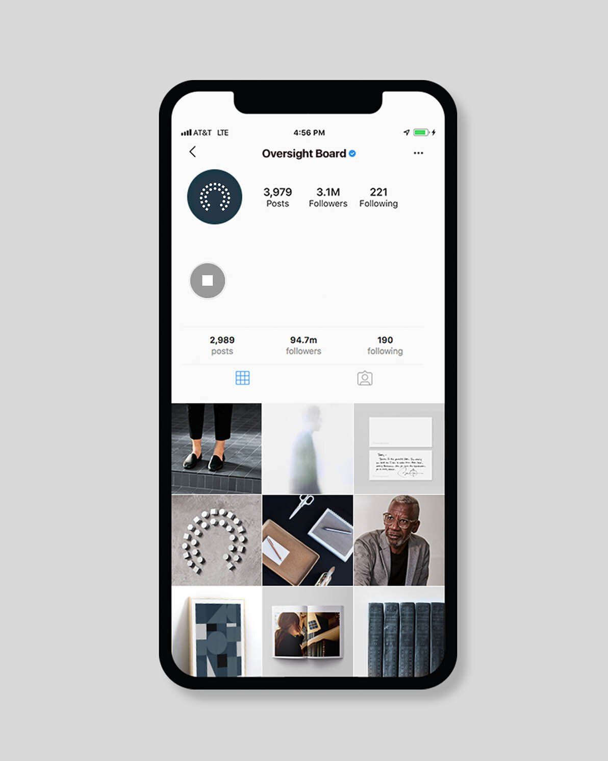
Meta has embarked on a sensitive and timely endeavor by creating an Oversight Board, thus the client required a brand that was visually elegant, classic, and direct to signify trust and stability. The Board is an independent body, and so it was important that the visual aesthetic of the Oversight Board set itself apart from the Meta identity.
The mark cleverly emulates the shape of a council seating arrangement, and the 3 forms utilized within the shape signify diversity in background, location, ethnicity, and area of focus. A customized version of the typeface Sentinel was created to pair with the mark and match it’s academic and precise qualities.
We pulled together strategy, translated logotypes, color palettes, supporting typography, photography and illustration guidance, and wrapped all the other fun and nitty gritty pieces into a comprehensive brand book document. The online product, designed by the creatives at AKQA, and the catalyst for this brand work, recently launched at oversightboard.com.
Disciplines:
Logo Design
Brand System Design
Brand Guidelines
Credits
Creative Director: Tyler King
Senior Designer: Bradley R Hughes
Senior Designer: Charles Perrault
Photographer: Nicholas Maggio
Accounts: Bryan Detwiler
Project Management: Andrew Plempel
Created at AKQA


